For those of you who know me, it will come as no surprise that I am excited as all hell for the 2010 Winter Olympics in Vancouver, since I love Canada, love the Pacific Northwest, and love the Olympics. I also love skiing, winter, snow, sub-zero temperatures, and international sports, so it's a fair bet that I'll be tuning into NBC in February.
But as much as the women's biathlon or curling excite me, there is simply no international competition I enjoy more than Olympic Ice Hockey. I am stoked for the World Cup in South Africa next year, too, and with the US drawing England I'm drawing up all sorts of Revolutionary War insults for my Limey-supporting friends, but nothing compares to hockey.
Not only has Olympic Ice Hockey given the United States its undisputed Greatest Sports Moment Ever , it just so happens that every country I'm proud to claim heritage from is pretty good at it. Not only do I get to cheer on Team USA and Democracy, I also get to dabble in cheering for Tre Kronor, the Swedish National Team. I was in Sweden for the 2006 Games in Torino, and can attest that Stockholm went FUCKING NUTS when Tre Kronor bested rival Finland in the gold-medal game. Like, Red Sox 2004 levels of insane.
So, obviously I'm hoping that Tre Kronor and Team USA medal, with one or the other winning gold or silver. If Germany won bronze, I wouldn't be upset (they won't). But apart from that, I'm just hoping that teams with Bruins in major roles like Slovakia and the Czech Republic (Hello, Chara and Krejci) get eliminated quick so the Black and Gold can go home and rest.
But anyway, as the IOC just released the jerseys for the teams that made the Vancouver tournament, I thought I'd flex my uniwatch muscles and review each set, as they run the gamut from traditional to kinda weird.
BELARUS
Home and Away
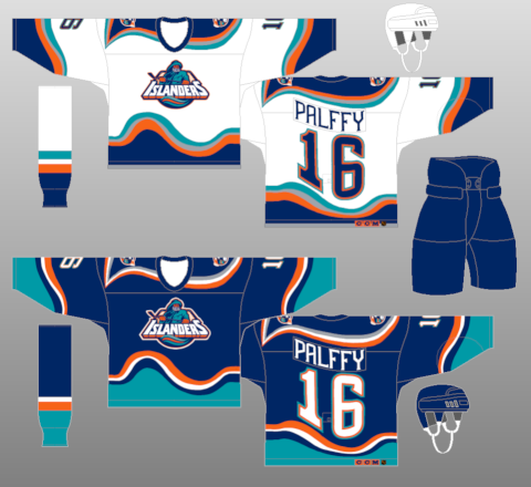
First of all, kudos for making the tourney. Something to be proud for Belarus, even if they were responsible for derailing the Swedes and their torpedo system in 2002. I like the simplicity of using the national colors in a way that's not overly flashy, though adding "Belarus" under the national coat of arms is a bit superfluous. Plus the arm stripes are a bit too Mid-90s Islanders for my taste.
CANADA
Home and Away
You would figure the country that invented the sport would get it right, and you'd be correct, to a point. I very much like the crest, which looks like your standard maple leaf until you take a closer look and realize it has designs that pay tribute to Canada's First Nations (Here's a closer look). Very cool multicultural angle. Though, I really don't like the shoulder yolkes, mainly because the captain's C and alternate captain's A bisect it, making it look weird. Other than that, solid jersey.
CHINA
Home and Away
How did China qualify for Olympic Ice Hockey?!? Seriously, someone tell me, because I can think of at least 3 former Soviet Republics that should have qualified before China. Anyway, boring and straightforward. I would have gone with the Mandarin characters for "China" as the frint crest. That would have at least made things interesting.
CZECH REPUBLIC
Home and Away
The Czechs are aided by a pretty snazzy national coat of arms, which they have used as the jersey's crest for several years now. Still dunno what to make of the hem-stripes, but it is what it is. Don't injure Krejci. Please.
FINLAND
Home and Away
Now, as a Swedish-American I am obligated to cheer against Finland, but even I have to admit they've made a serious upgrade from Torino 4 years ago. Sleeve stripes aside, the Finns have altered their crest to be simpler and more streamlined, as well as ditched the silly "Finland" wordmark from the jersey entirely. As you may know, "Finland" in Finnish is "Suomi", so it makes sense to have that on the jersey. But previously, the Finns had both "Suomi" and "Finland" on their jerseys, which is weird and repetative. If you're going to have a name on the jersey, at least make it the name of your nation in your native tongue. Even if that language is hilarious-sounding.
GERMANY
Home and Away
The Germans have had a varation on the Bundesadler (Federal Eagle) on their jerseys for a while now, bit this year has the addition of a weird watermark of the eagle to their sleeves. Unneeded, strange, and complicated. Personally, I'd say if you go rid of the Bundesadler on the sleeves, and got rid of the "Deutschland" wordmark on the front, you'd have a pretty solid jersey, but that's just me. Also, don't injure Marco Sturm, please.
LATVIA
Home and Away
Another team that deserves credit for making the Games in Vancouver. A good unique color combination with white and maroon, using the usual former Soviet republic design of national coat of arms and wordmark. As usual, I think the wordmark is a bit redundant, though I like that it's at least not a simple English translation (couFINLANDgh)
NORWAY
Home and Away
I was also surprised that Norway qualified for the Games, as they and Denmark are usually the odd men out when it comes to hockey. While Swedish players comprise 4.7 % of NHL players, and Finnish players 4.1 %, there have only been 5 Norwegians to have played in the NHL. EVER. But congratulations to the Norwegians, and congratulations for their jersey design. Simple, classic. and straightforward, i really have to say I like them. Best of luck in the tournament.
RUSSIA
Home and Away
I like the double-headed eagle, and actually I like the Cyrillic "Russia" wordmark underneath. The interesting font is hit or miss, and the armpit stain color panels strike me as a bit unneccesary. Not as classic as their old unis, but still not so bad. BOOOOO OVECHKIN.
SLOVAKIA
Home and Away
Honestly, not a bad uniform, especially since they avoided using a wordmark on the jersey. It helps that Slovakia has a simple and memorable crest, so they don't really need it. Bow out gracefully, and send back Chara in working condition.
SWEDEN
Home and Away
Tre Kronor hasn't changes their look a terrible amount in recent years, and while I'm not sure that spiffing up the shape of the crowns was really needed, the lace collars are certianly welcome, as are the traditional sleeves stripes. Fingers crossed about a gold medal...
SWITZERLAND
Home and Away
Things to like? Minimalist approach and basic colors like red and white. Things not to like? Why is the Swiss Cross relegated to the corner of the jersey? What was so bad about having the cross front and center?
UNITED STATES
Home and Away and Third
The United States has made a good improvement from the unis they were saddled with over the last few years, especially since they're the only team to take advantage of the third jersey option for the Olympics. I really like that the stupid "Flag S" has been retired, as the Americans return to a look that served them well in 1980. I really like the use of the 1960 throwbacks, too, even if they are a transparent cash-grab. The diagonal look is quite good, and I like that it calls back to the gold-medalists in Squaw Valley in 1960. Having throwbacks to the Miracle on Ice would be too easy, and it would be ignoring another proud chapter in American hockey. Very, very nice, all things considered.
So, there's the docket for Vancouver. All in all, should be an aethetically pleasing tourney, and here's hoping Tre Kronor and Team USA find glory out West. I certainly can't wait.
-M
No comments:
Post a Comment